How to add more information to map hover info box
In this tutorial we cover how to use the display field dropdown to add extra information to you map info boxes.
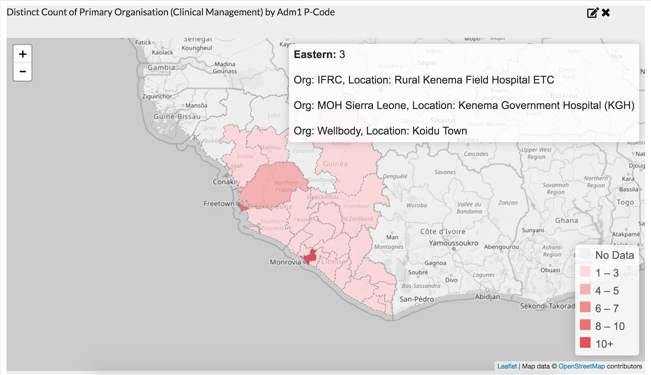
A dashboard with added text to the map info box showing the orgs and locations they are working.
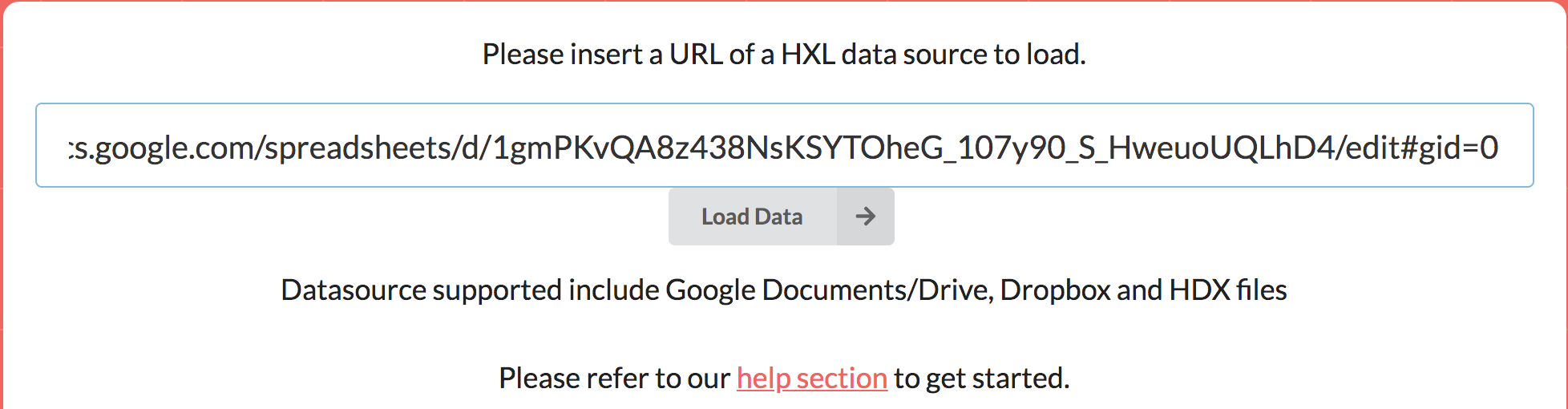
1. Load the data
For this tutorial we will be using a dataset of Ebola cases by treatment centre. The number of cases and deaths are not real. This data set is purely for use with this tutorial.
Drop the dataset into the HXLDash load data screen and click load.
A dashboard with add text to the map info box showing the orgs and locations they are working.
Once loaded the first panel gives an overview of the suggestions maps and graphs generated.
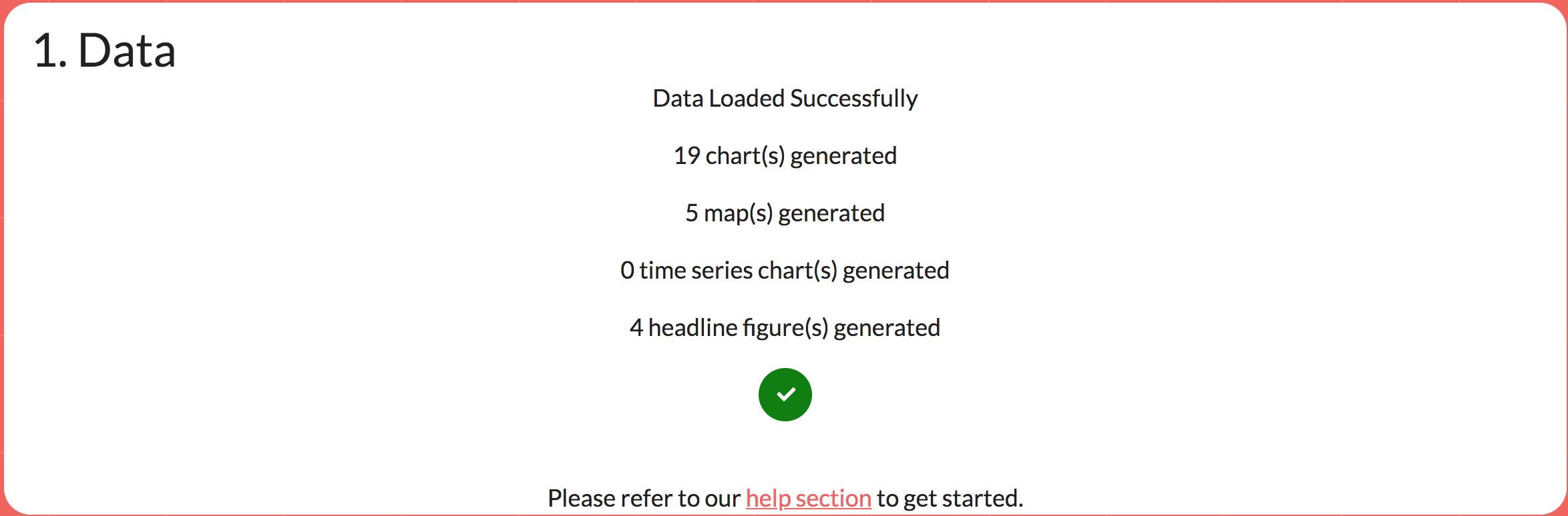
Intelligent suggestions overview.
2. Setting up the dashboard
Select the single large dashboard layout in the bottom left. Optionally add a title and any filters or headlines numbers you want. For more details on creating maps please read the area map tutorial.
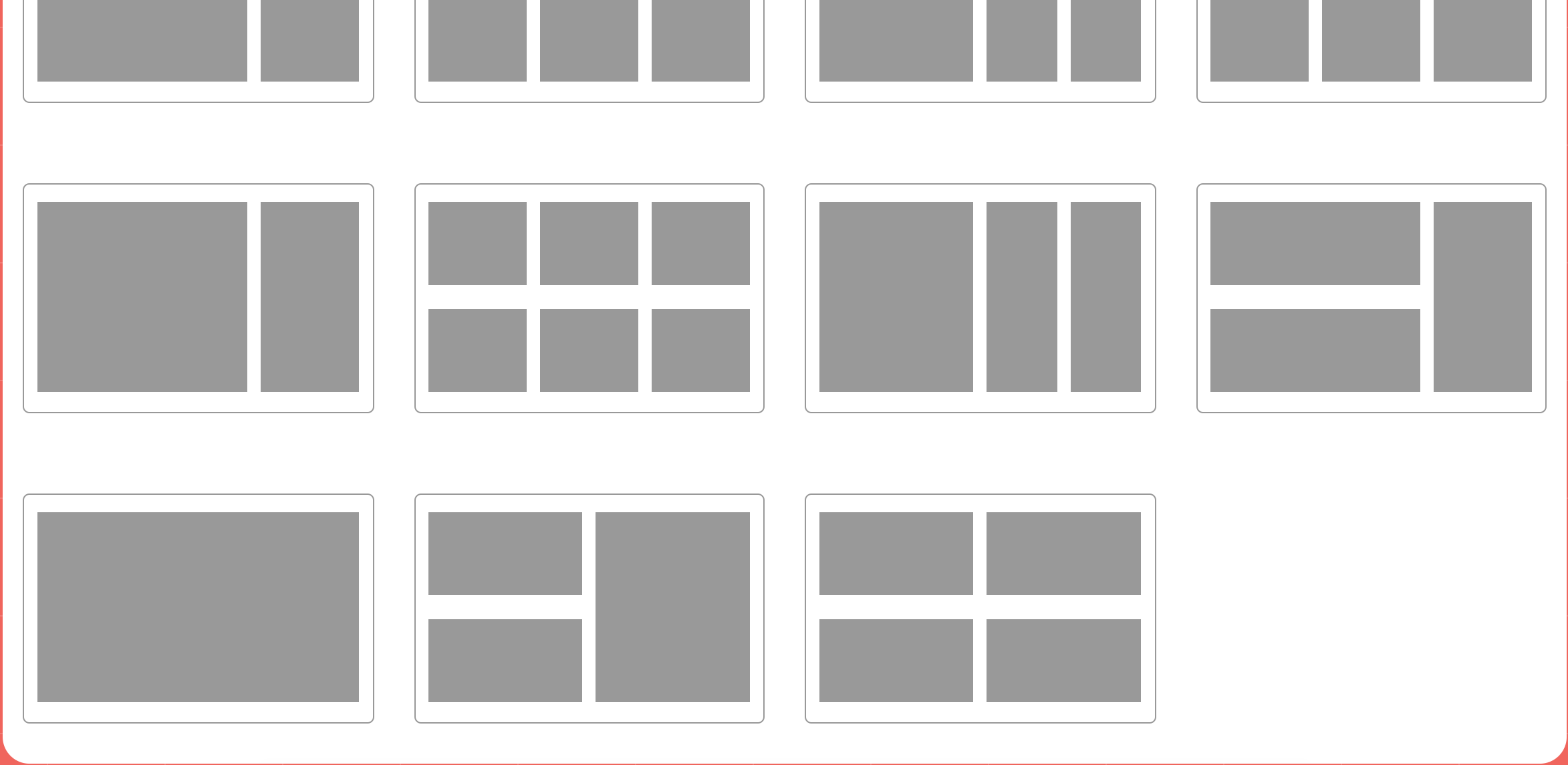
Picking a layout for the dashboard
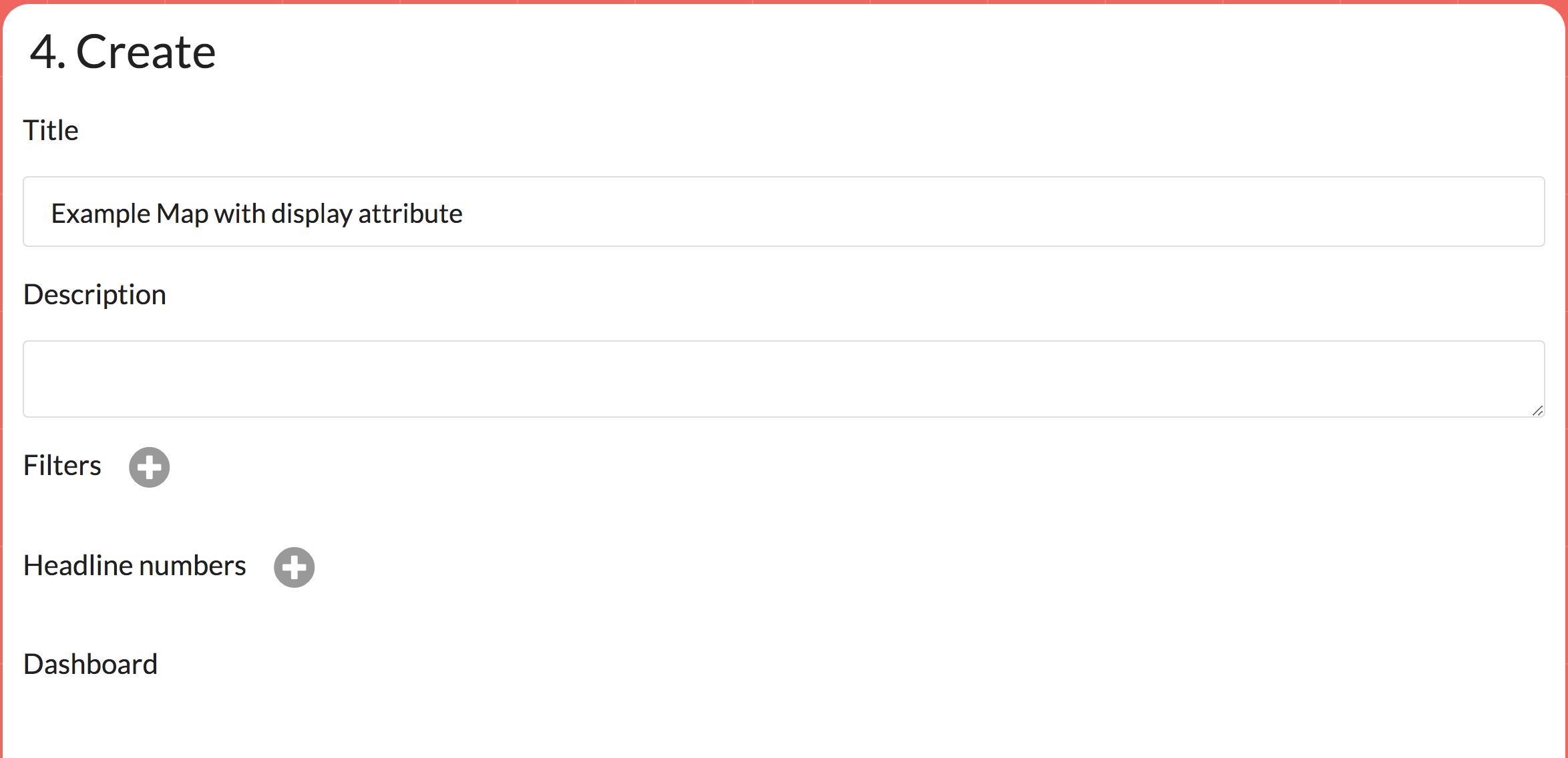
Optional extras such as adding a title.
3. Create a map
Next click the add buttom at the top of the dashboard layout. You will be presented with a set of graphs to add. Click the maps tab and then choose the map Discount Count of Primary Organisations.
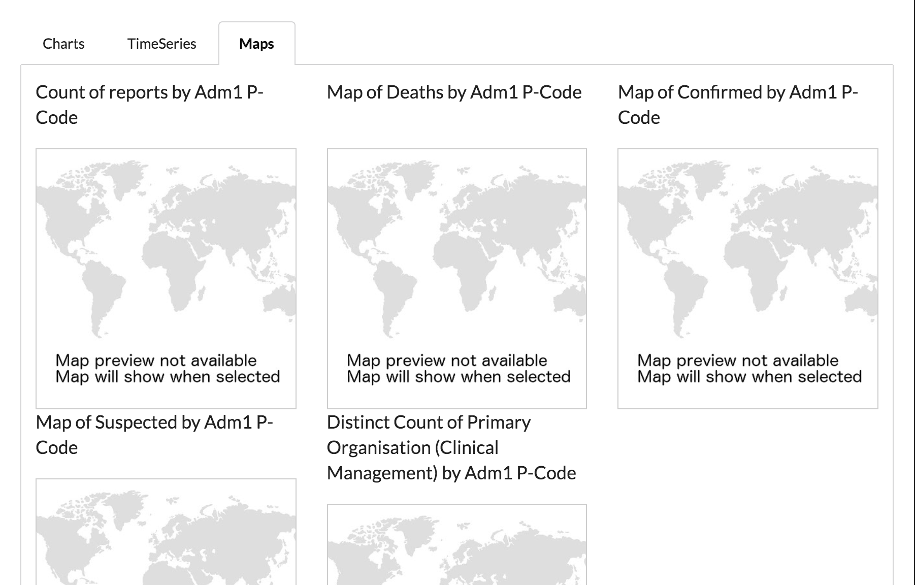
The map selector
This is a map quite often used by humanitarians for a 3w (who, what, where). An organisation might be reported multiple time working in an area over different sectors. This map only counts distinct organisations, so as not to double count one organisation and inflate the number.
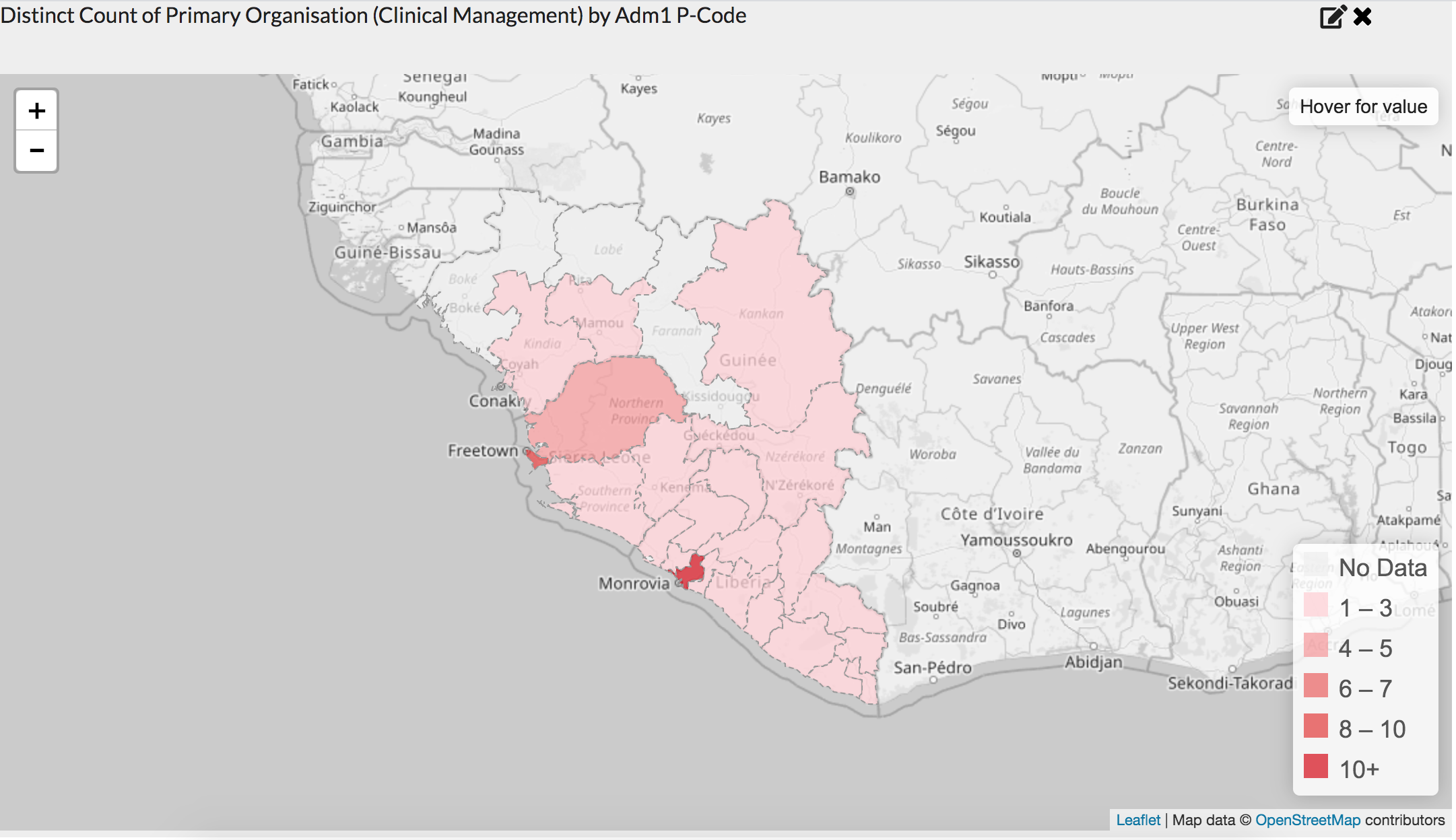
A map of number of organisations working per area.
4. Adding the display options
In the top right hand corner of the map there is the edit button represented by the pen. Clicking this brings up the map options menu.
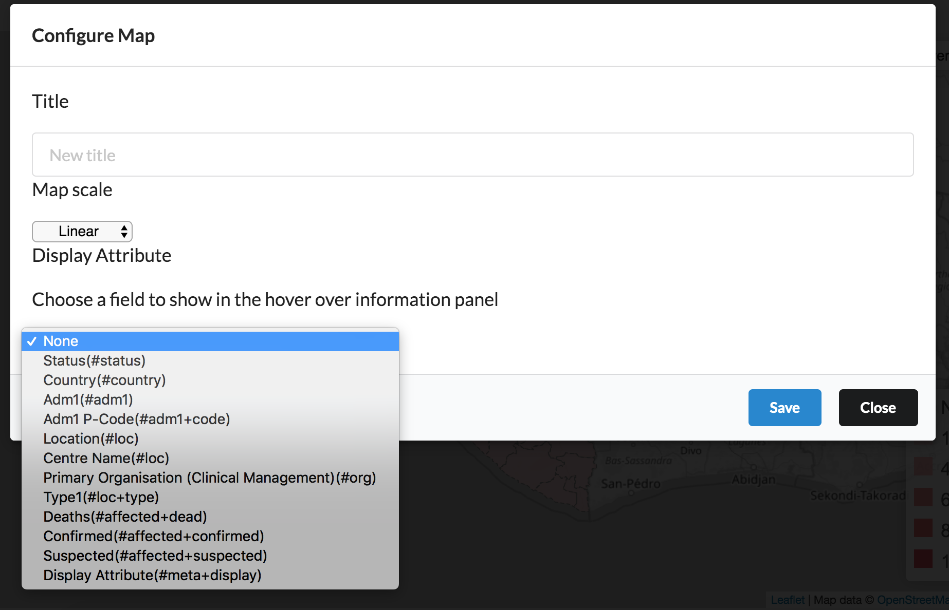
The map options menu
The drop down menu below the words Display Attribute show the fields from data set. Select Primary Organisation (#org) and click save. Now when you hover over an area it lists the organisations working there.
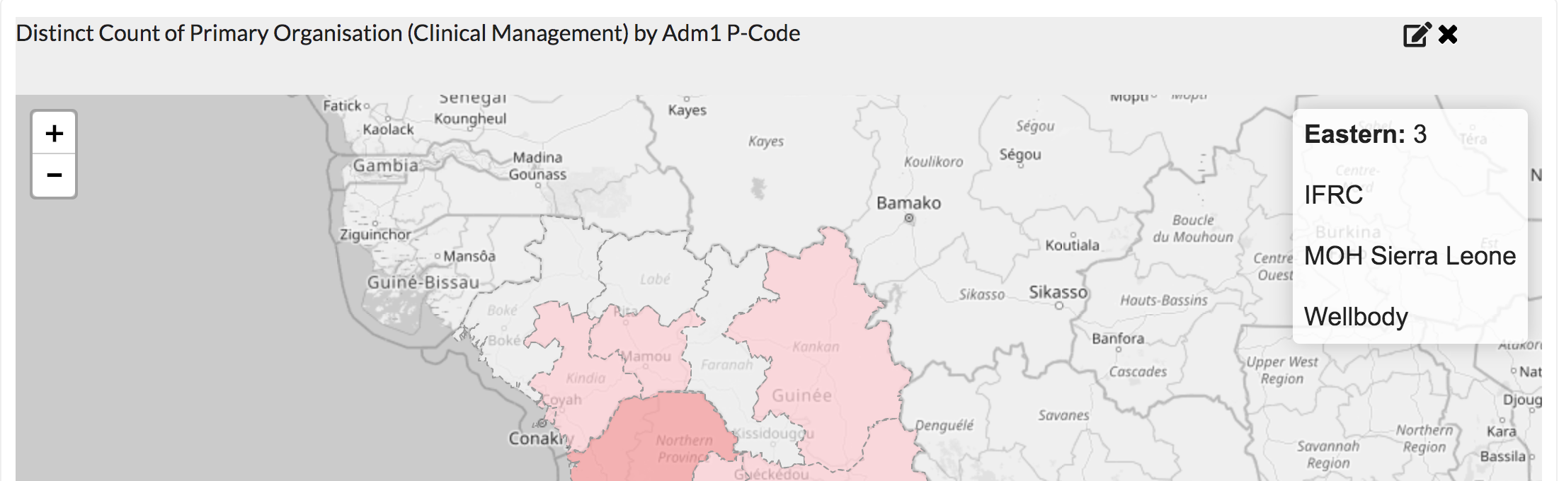
The organisation is now used as the display attribute
5. Customising the attribute
It's possible to add customised display attributes by using functions in a spreadsheet.
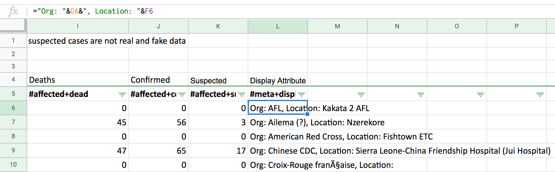
Using spreadsheet formulas to create a new field
Here we combine the organisation column and the location column via a spreadsheet formula to create a new column containing both. Choosing this column in the chart options displays the newly created field.
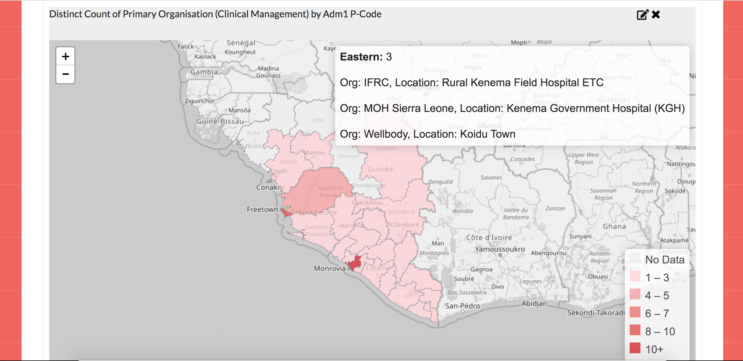
The hover details now show data from multiple columns as seen below.