Using Pcodes to create area (choropleth) maps
HXLdash is capable of two possible maps type. Point data and area data. This tutorial will guide you through how to create an area map (choropleth maps).
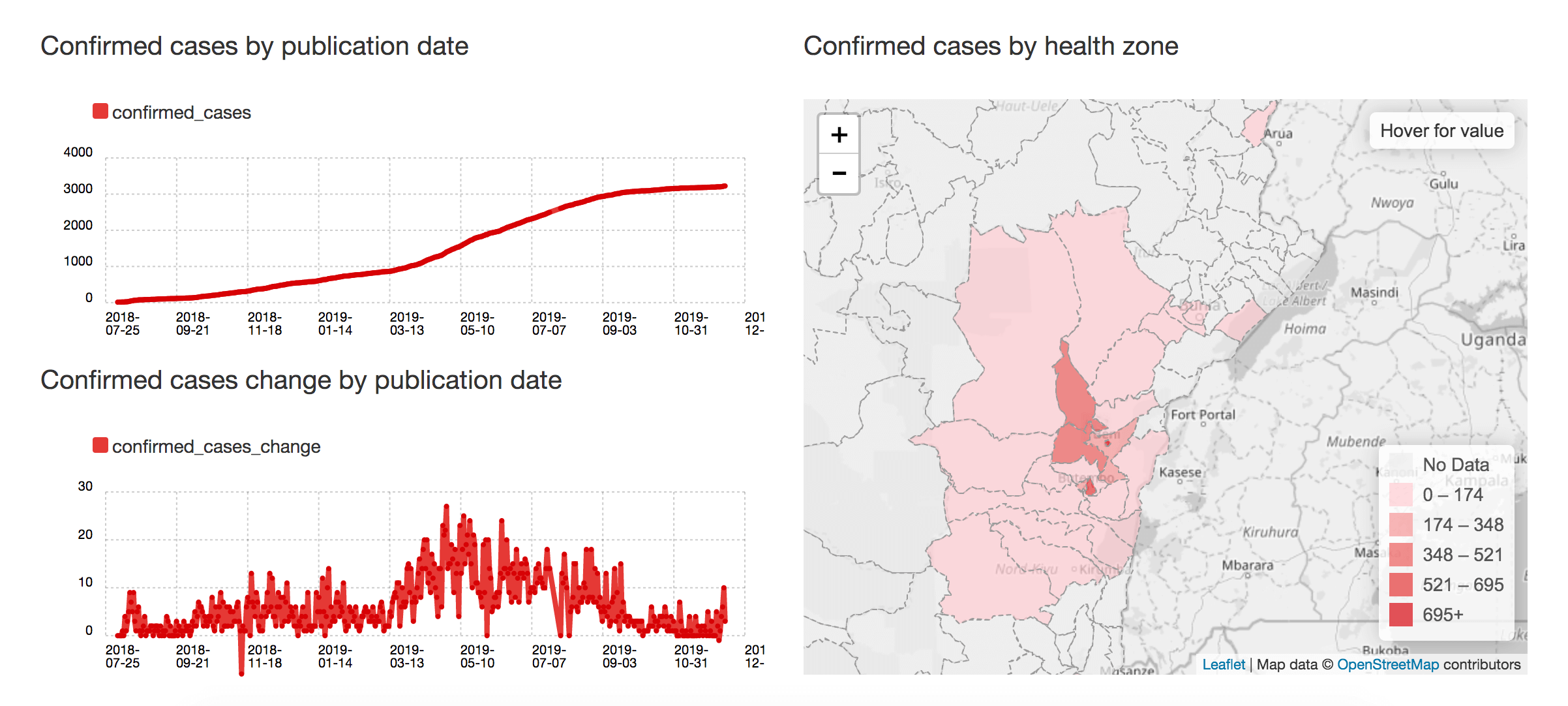
A choropleth map of Ebola cases in DRC
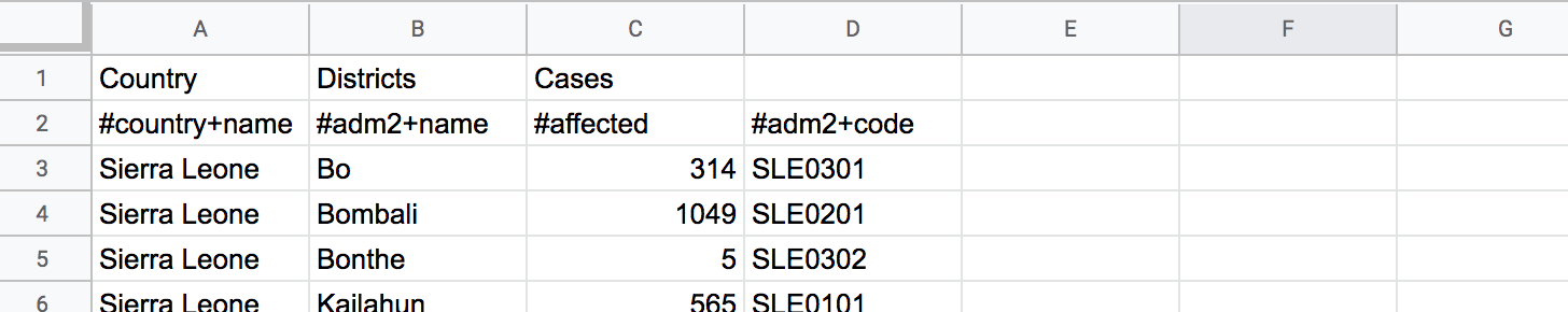
A. column with pcodes
B. The pcodes should be for a country supported by HXLDash
C. A column with values in it
A. Supported countries
Area map or choropleth maps only work for the countries HXLDash currently supports.
The full list of supported countries.
If the country you want is not on the list send us a message and we will try to get in up in a couple of days.
B. PCodes
For those not familiar with place codes or pcodes, they are codes given to geographic administrative boundaries in countries by the responding humanitarian organisations. The purpose is to easily identify places in data sets to overcome two problem. That the same place can be spelt differently or different places can have the same name.
Pcodes generally have a format like
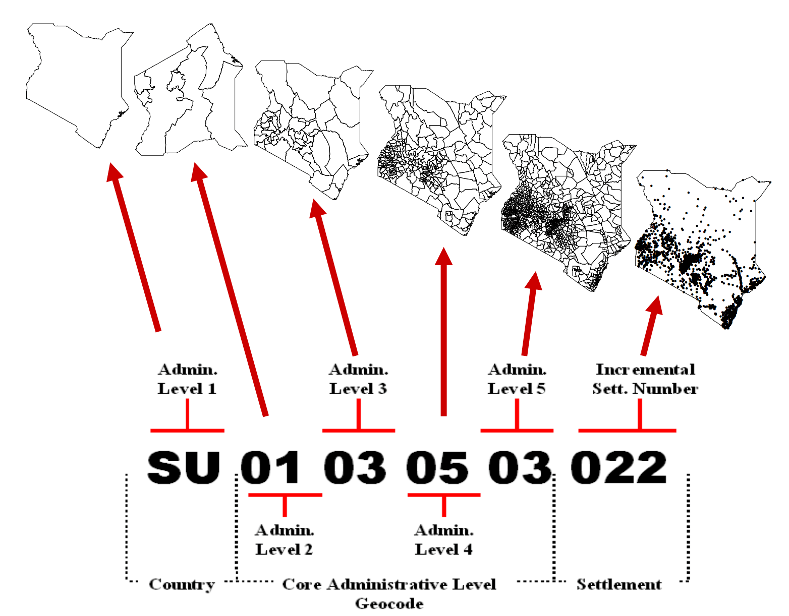
Examples of Pcodes in Ethiopia
More details about pcodes can be found on the humanitarian response website.
Once you are using the pcodes for you country make sure you use the correct HXL tags. The tags that will trigger a choropleth map:
#country+code, #adm1+code, #adm2+code, #adm3+code
C. Mapping against a value
The final ingredient is needing a column with values so the colour of each area can be calculated. The following value columns are supported for maps.
#value, #affected, #population, #reached, #targeted, #inneed, #indicator+value, #capacity'
Example of how to make a choropleth map for Ebola cases in Sierra Leone
For this tutorial we will use a dataset on Ebola cases in Sierra Leone.
1. Loading the data
Grab the URL of the google spreadsheet and drop it into the load dashboard data input. The dataset has the three key ingredients. A. Sierra Leone is supported by HXLDash, B. We have #adm2 pcodes and C. We have a column wih values and the #affected tag.
Ebola cases dataset
2. Choosing your layout and color style
The data set is automatically processed and shows the number of charts and maps generated

The data set is automatically processed and this section show the number of suggestions for maps and charts generated.
The next section allows you to pick a layout. For this tutorial we will choose a single large box for the map. This layout is in the bottom left.
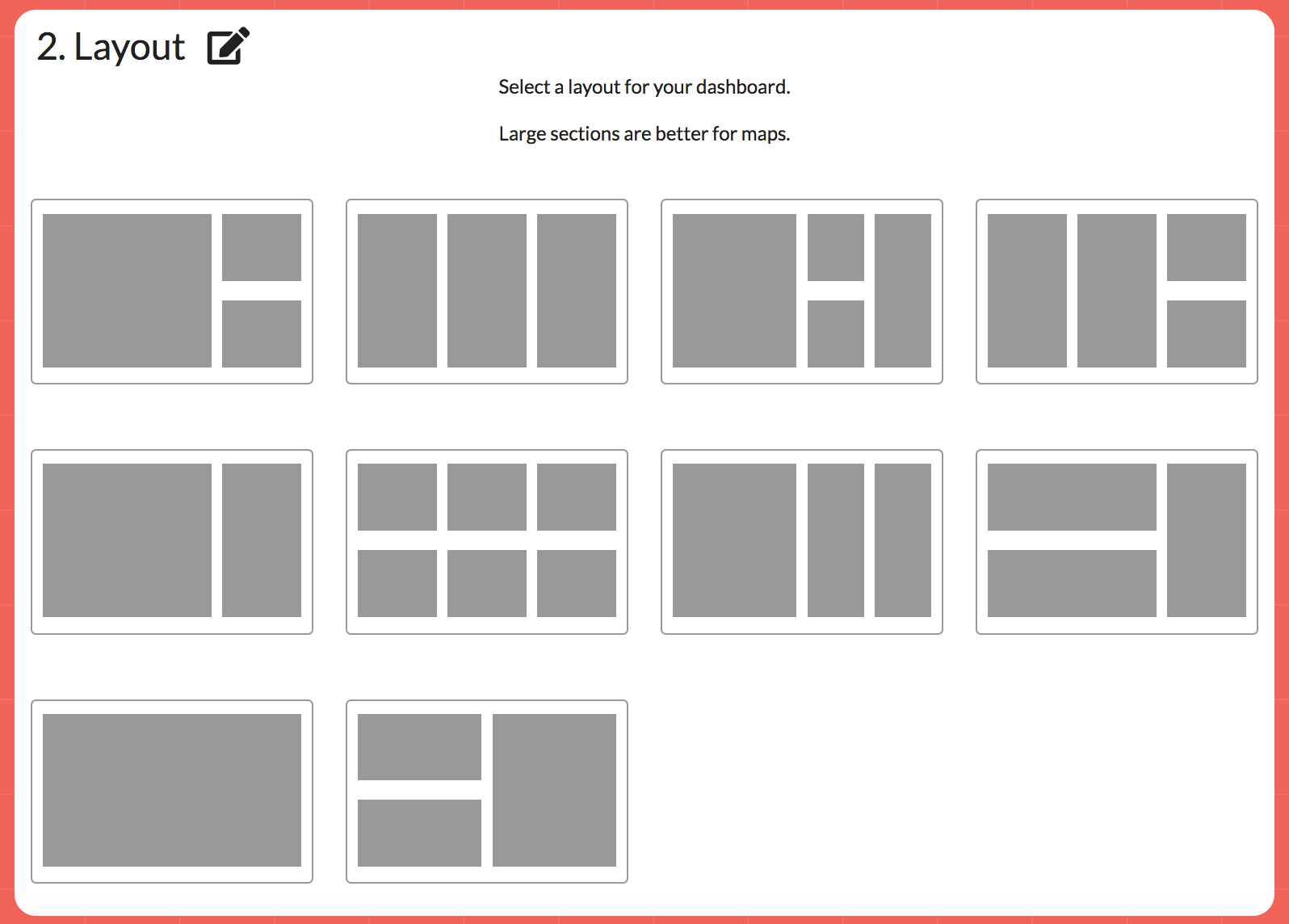
Choosing a layout
And lastly you can pick a colour of your choice. In this case for now we will use the default red.
3. Adding the map
On the layout click the plus icon to get the chart and map selector. Click the maps tab and then select the map labeled "Map of cases by district code".
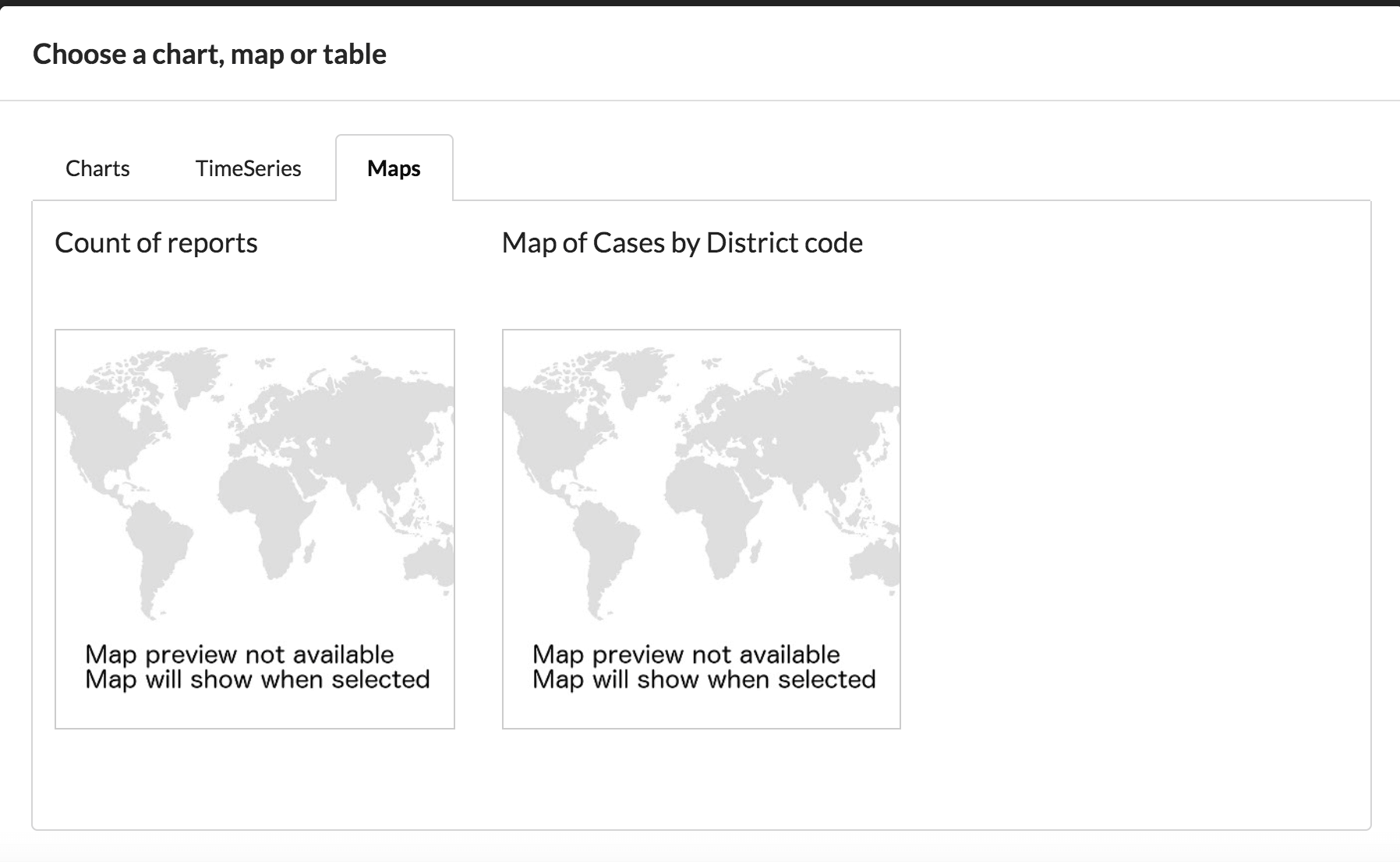
Selecting the map
This will auto generate the map with suitable legend and title. To make this map online so you can share click save and complete the optional meta data fields. The map is now ready to share.
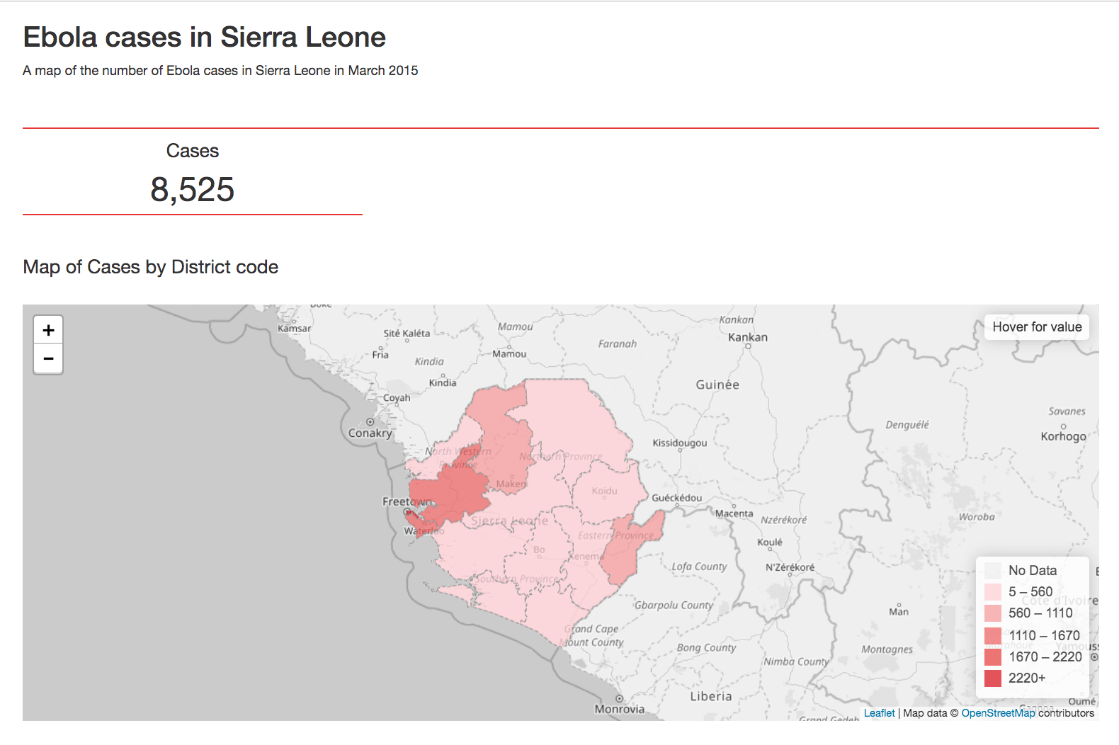
The final result - https://hxldash.com/view/229