Quickstart
A 5 minute guide to creating dashboards with HXLDash. In this guide we will visualise a dataset of ebola treatment centres from the 2014 West Africa outbreak. Feel free to replace it with your own data and follow along.
HXLDash uses the HXL Humanitarian Exchange Language (HXL) tags and a suggestion engine to create charts and maps that make sense for your data set. These suggestions are then used to build the dashboard in just a few clicks. The suggestions engine reduces the need to have a complex interface to build charts.
The suggestion engine works by analysing the tags present in your dataset, comparing them against a list of pre defined recipes for charts and maps. If the tags are present then the chart or map is produced.
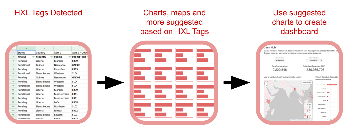
Overview of intelligent suggestions process
1) Data Preparation
HXLDash works with data that is in the Humanitarian Exchange Language (HXL) format. This involves adding a line of agreed up tags below your headers. Visit the HXL Standard Website for more information. Use the HXL postcard or HXL tagging tool to help you add tags.
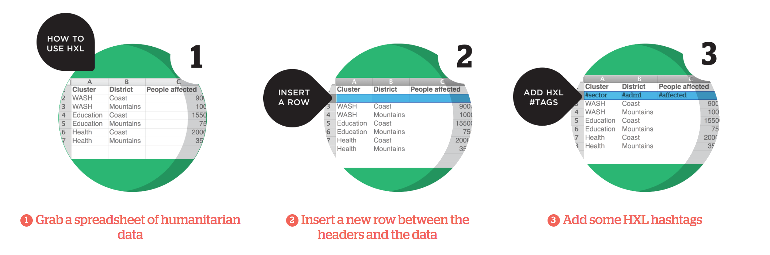
How to add HXL tags to your data set.
We have a data set ready for you to use with this tutorial if you do not have your own HXL data. Please find the link to the data here.
2) Hosting the Data
None of the data that is visualised is hosted on HXLDash servers. Instead we ask users to use third party hosts such as Google Drive, DropBox, OneDrive etc. For HXLDash to be used the data has to be shared via a public URL. Therefore HXLDash should not be used for sensitive data.
! There are plans for HXLDash to be able to host secure data in the future !
The example data is already set up, but if you are using your own data then ensure it is shared publicly and you have the URL. On Google Sheets for example this is done by clicking the 'Share" button and then choosing 'Anyone with the link can view'.
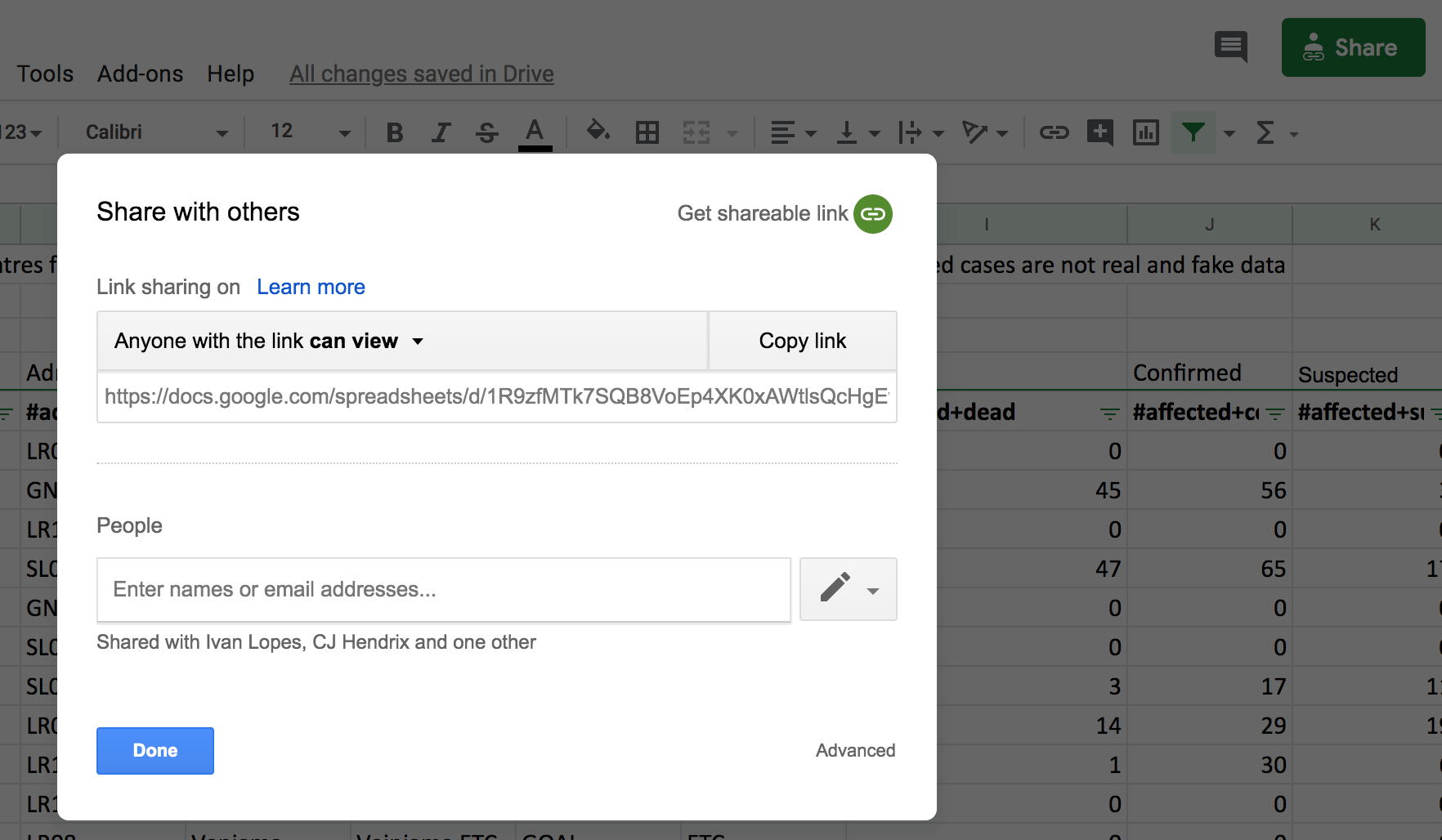
How to share data publicly on Google Sheets
3) Loading the Data
To load the data into HXLDash use the following link and paste your dataset URL into the text field and click 'Load Data'
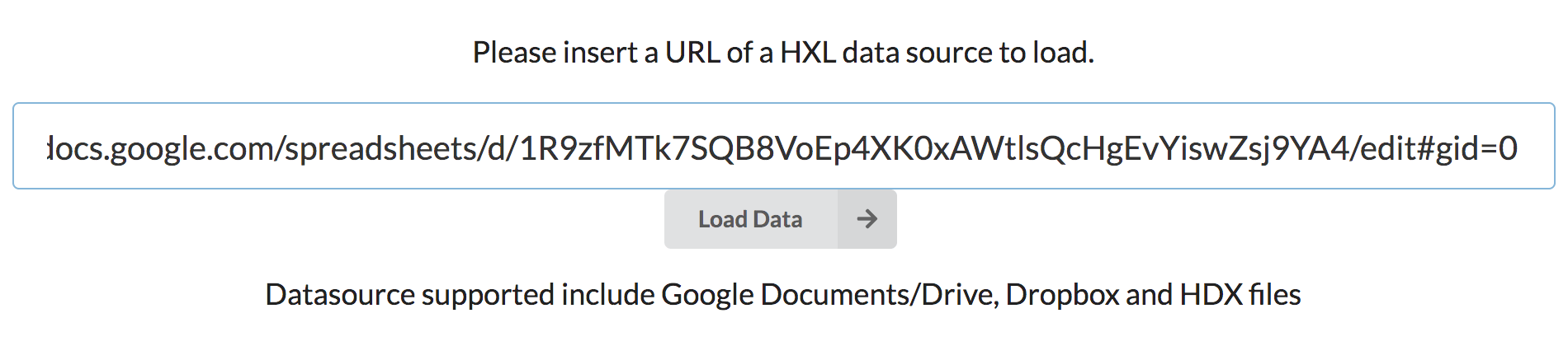
Loading data into HXLDash
! If you get the error:
Please check data source has HXL tags and is accessible from the web (sharing is turned on)
with your own data then recheck the first two steps !
4) Choosing the layout
Wait a few seconds for the data to be loaded. Once it has successfully loaded it will show the number of chart, map and headline figure suggestions it has generated.
The next step is to choose the layout for your dashboard. The layouts are represented in miniature. Click to select the layout you have chosen. If you are using the Ebola data we recommend the layout in the top right. At anytime you can go to the layout selector and choose another layout. If a layout you want is not present, then send us a message and we add it in the next update!
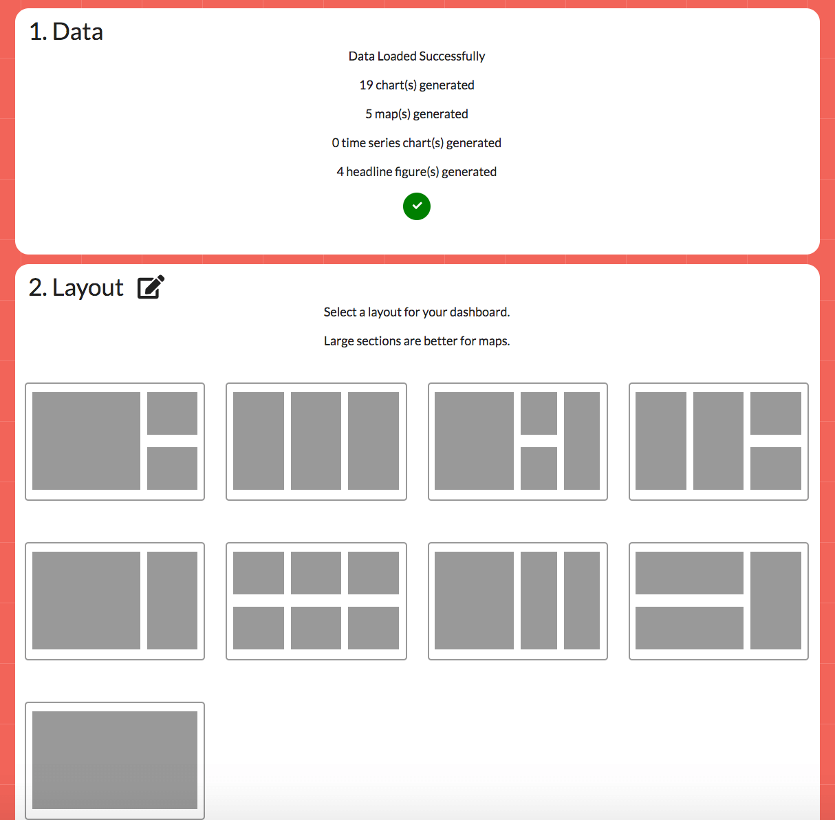
Layout selector
5) Selecting a colour
To select a colour for your dashboard click the colour you want. It can be changed at anytime to another colour. A colour you want is no there? Send us a message and we will add it in the next update.

Selecting a colour
6) Adding a title and description
Add a title and description in the corresponding boxes to appear above your dashboard.
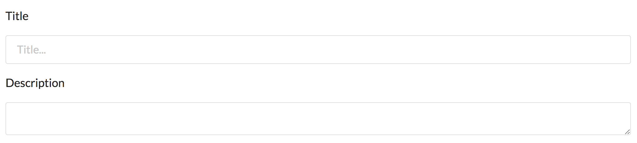
Setting title and description
7) Filters
Filters are dropdown menus by which you can filter the data shown in your dashboard. These are an optional item.
Filter selection
Open up the filter selector by clicking the large plus sign. Three boxes will appear and each can contain a filter.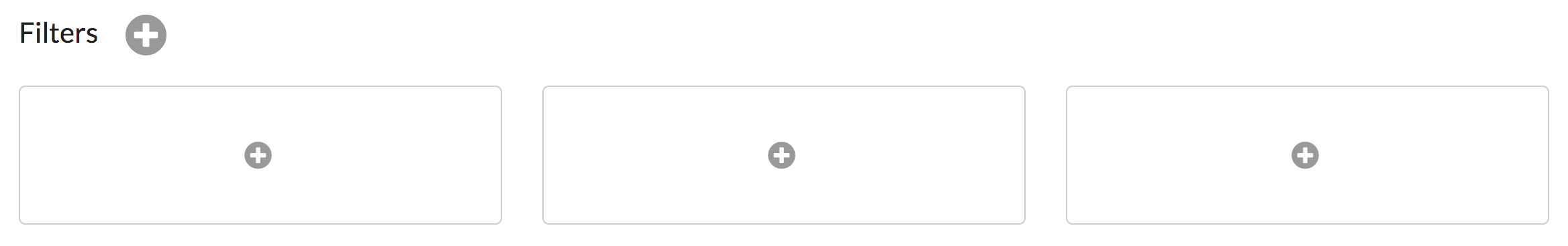
Filter selection
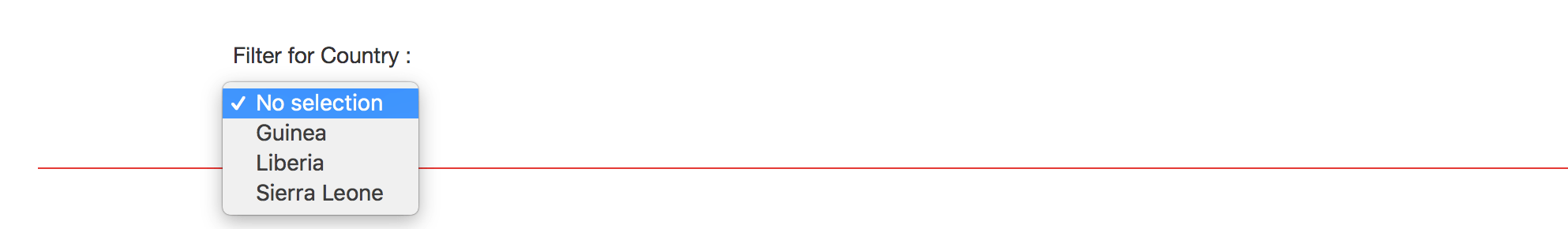
Clicking the plus sign in a box will bring up the add filter menu. Select the column which you want the filter to act open. In the example above country was chosen which then gave the option to filter the data by Guinea, Liberia and Sierra Leone. Once a filter has been added click the edit icon () to change it or the delete icon () to remove it.
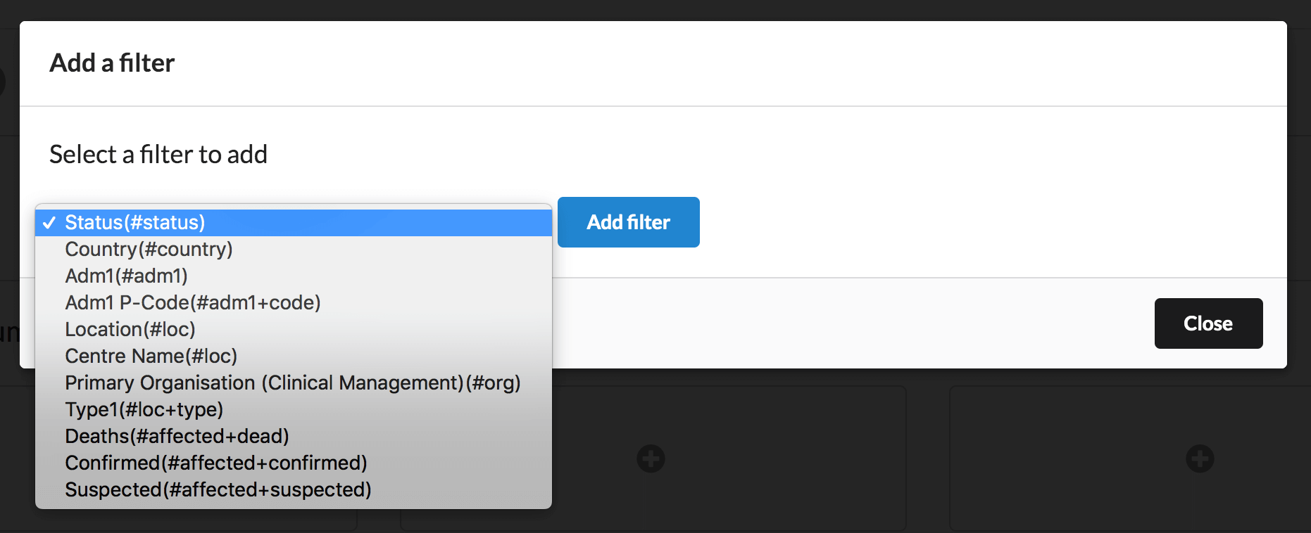
Filter selection
8) Headline figures
Headline figues are large summary numbers for your data set. You can add up to 3 at a time.
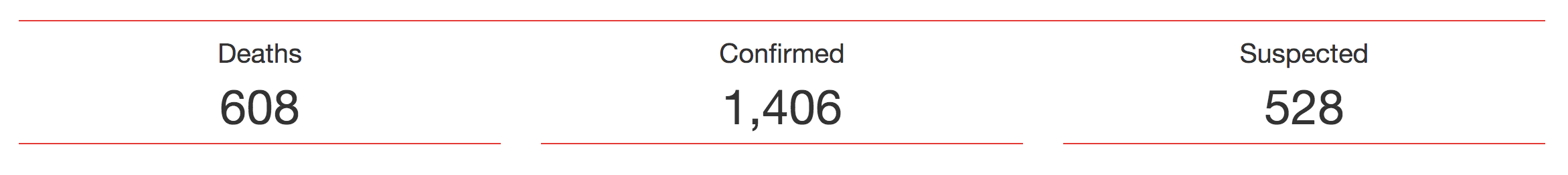
Headline figures for the Ebola dashboard
Choosing a headline figure occurs in much the same way as filters. Click the plus icon to open the headline figure selection menu and click the headline figure you want to add. If the headline figure you want is not appearing check out the FAQs.
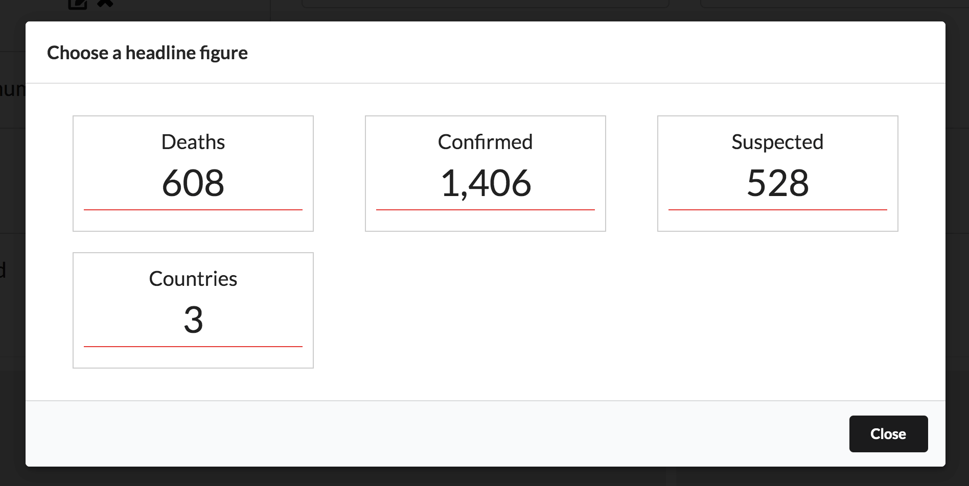
Headline figure selection menu
9) Chart and Map selection
Below the headline figures you will find the layout you chose in step 4 of these instructions. To add a map or a chart click a plus icon in the layout.
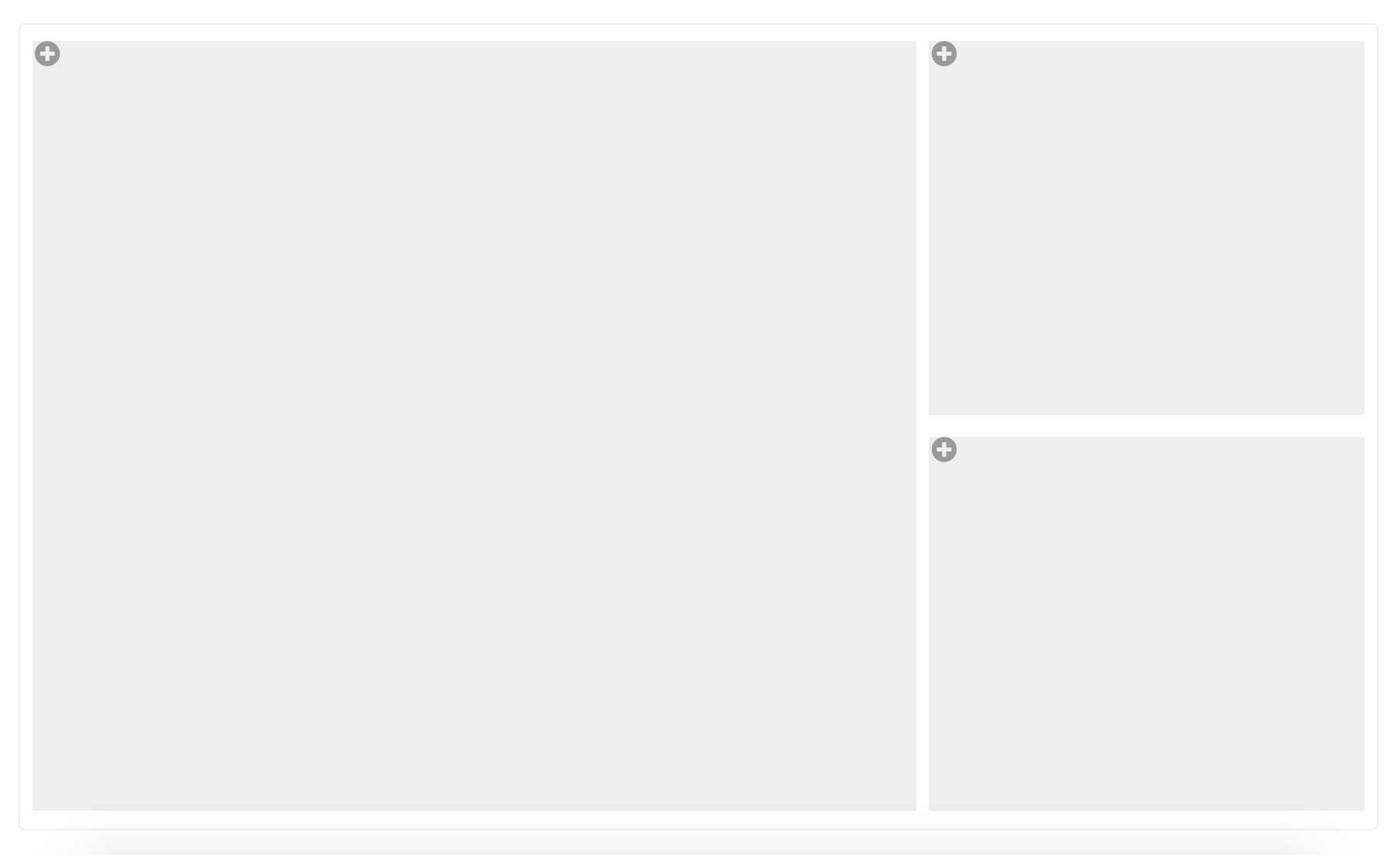
Dashboard Layout
The chart and amp selection menu will open. It has 3 tabs, row charts, time series charts and maps. Clicking on a chart or a map will add it to the dashboard layout.
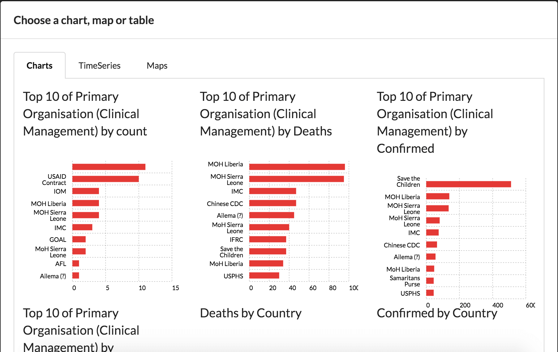
Chart and map selection
10) Changing details
On charts and maps clicking the edit buttons provides further options such as renaming the automatically generated title and change the scale of the data on the map.
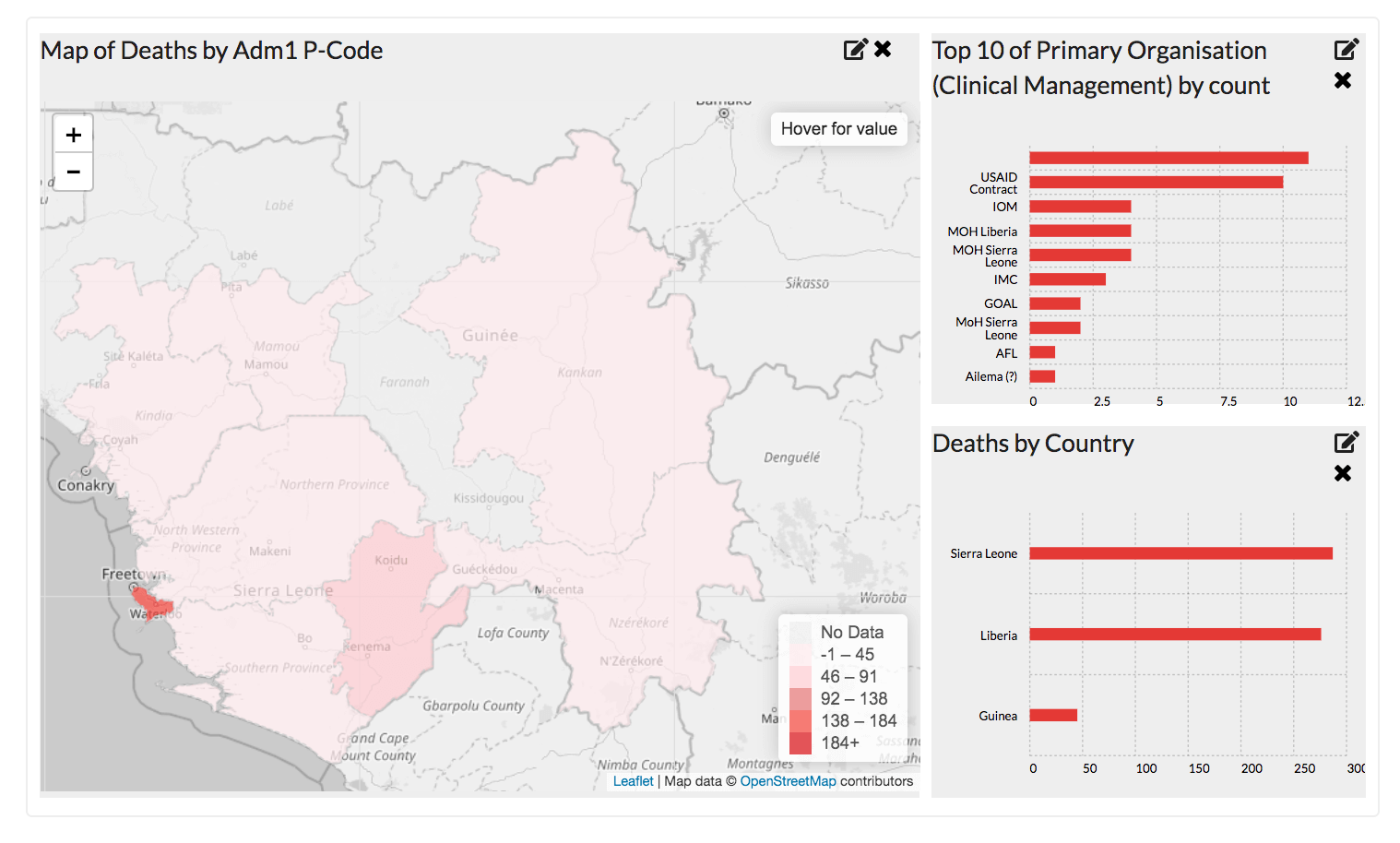
Dashboard layout with charts and maps chosen
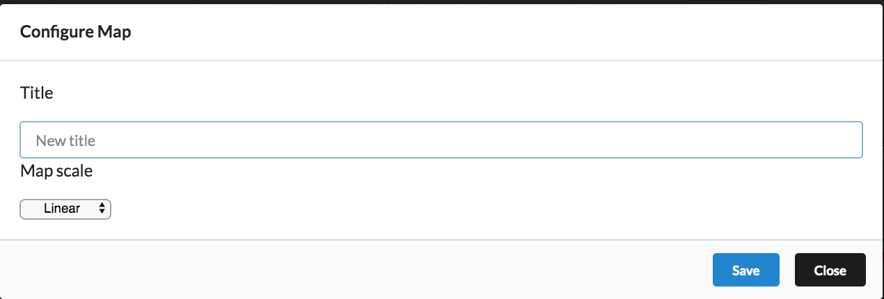
Further options in the edit menu
11) Data tables
A data table can be added below the dashboard by sliding on the data table checkbox
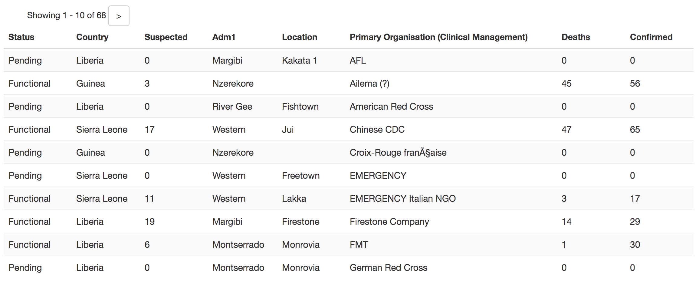
Data table example
Once the data table is turned on you can select which columns you wish to show. We recommend chosen no more than 8 columns to make the data easier to understand.
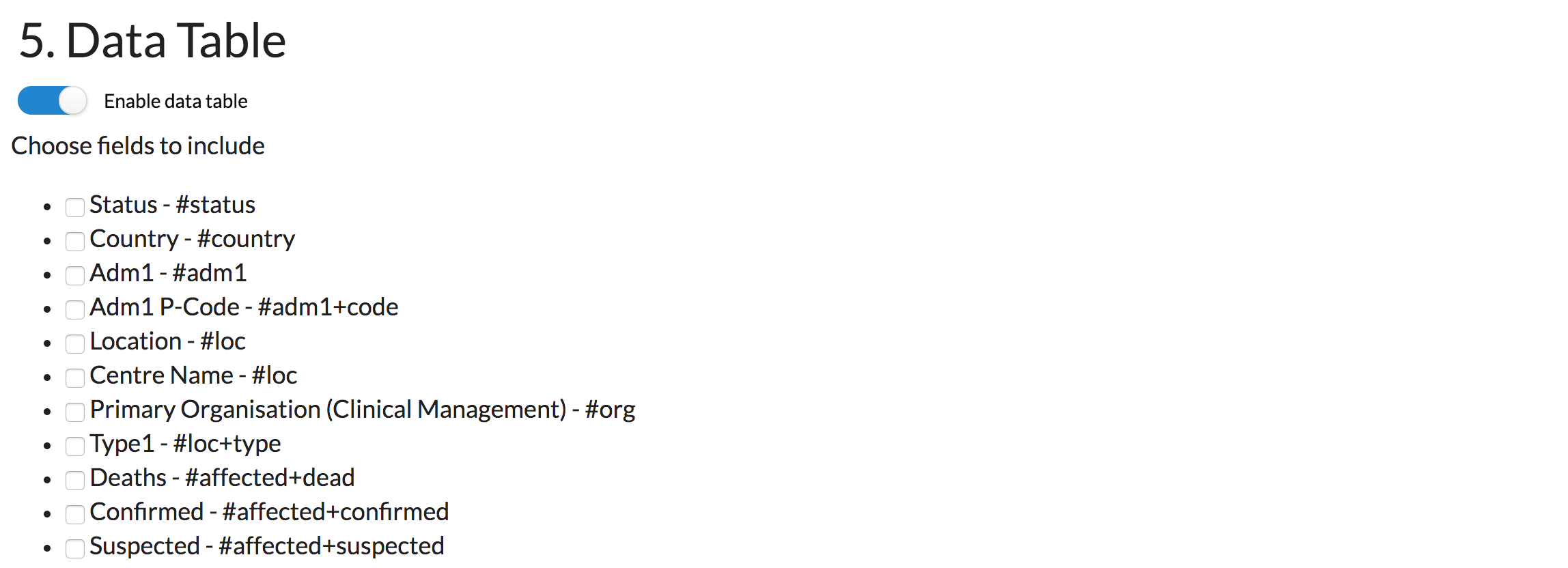
Selecting data to include in the data table.
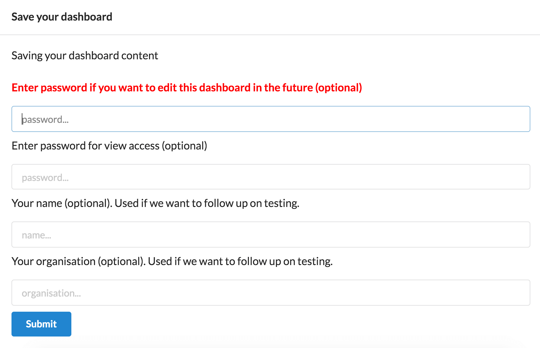
12) Saving
Once you have made all the edit and changes you want to the dashboard click the 'Save' button to bring up the save menu.
There are 4 fields in the save menu. The top field is the most important. It's the password to use if you ever want to edit the dashboard again in the future. The second field is if you want to set a password for anyone trying to view the dashboard. Leave blank to have no password on the dashboard. Finally field 3 and 4 are to help us understand who is using HXLDash. Click save to then view the final dashboard.
Dashboard layout with charts and maps chosen
13) Editing
If you ever want to go back and make changes to your dashboard click the edit button in the bottom right of the footer. Use the password you set in the previous stage.

Dashboard layout with charts and maps chosen