How to create a quick point map with HXLDash
A 5 minute guide to creating a point web map with HXLDash. In this guide we will visualise a dataset about airports in Mozambqiue.
1. Preparing your data
For a data set to be used with HXL Dash is has to be in the Humanitarian Exchange Language (HXL) standard. For this tutorial we have a prepared data set from the Humanitarian Data Exchange (HDX) about airports in Mozambique. Click to get the dataset.
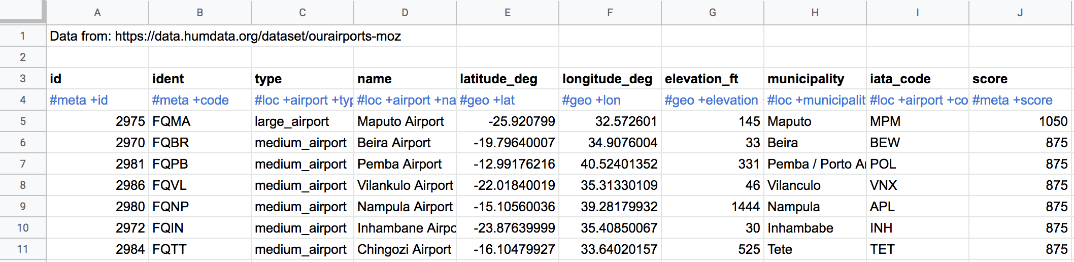
The dataset headers are in the third row. HXL tags in the fourth row and data from the fifth row onwards.
For point mapping to be activated the data set must contain #geo+lat and #geo+lon. If don't have latitude and longitude data in your data it is possible to add via the process of geocoding. Some free geocoders are avaiable on GPS Visualiser.
Currently the public version of HXLDash does not have the features to securely store data, so we recommend only using data that is non-sensitive.
2. Loading your data
The next step is to load the data into HXL Dash. Grab the URL of the google sheet and click load or alternatively visit this link to the data preloaded into HXLDash
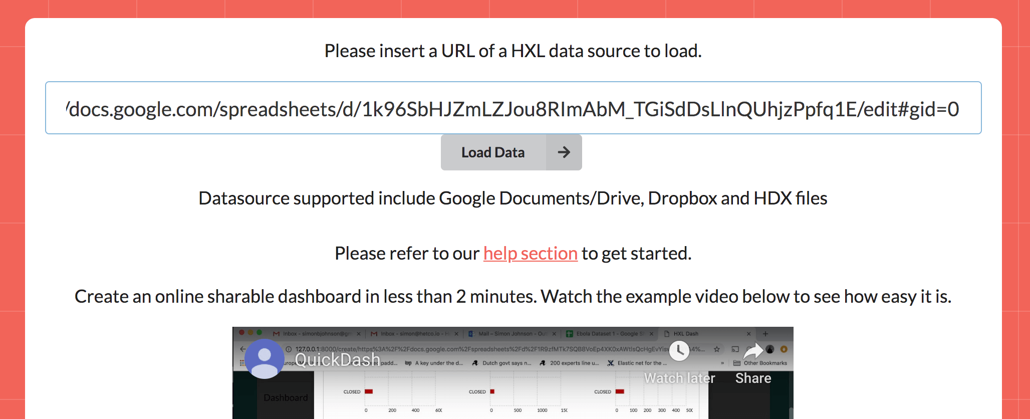
Paste the URL of the data set in HXLDash and click load.
3. Choosing your layout and color style
The data set is automatically processed and shows the number of charts and maps generated

The data set is automatically processed and this section show the number of suggestions for maps and charts generated.
The next section allows you to pick a layout. For this tutorial we will choose a single large box for the map. This layout is in the bottom left.
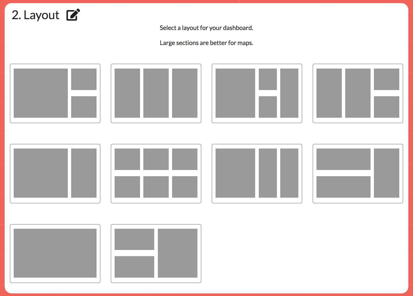
Choosing a layout
And lastly you can pick a colour of your choice. In this case for now we will use the default red.
4. Setting the title and adding a filter
We now set the title for the map and can add a description. We also use the menu to add a filter. This is done by clicking the plus sign in the fitler boxes. In this case we added a filter for #loc+airport+type so the map can be filtered for type of airport.
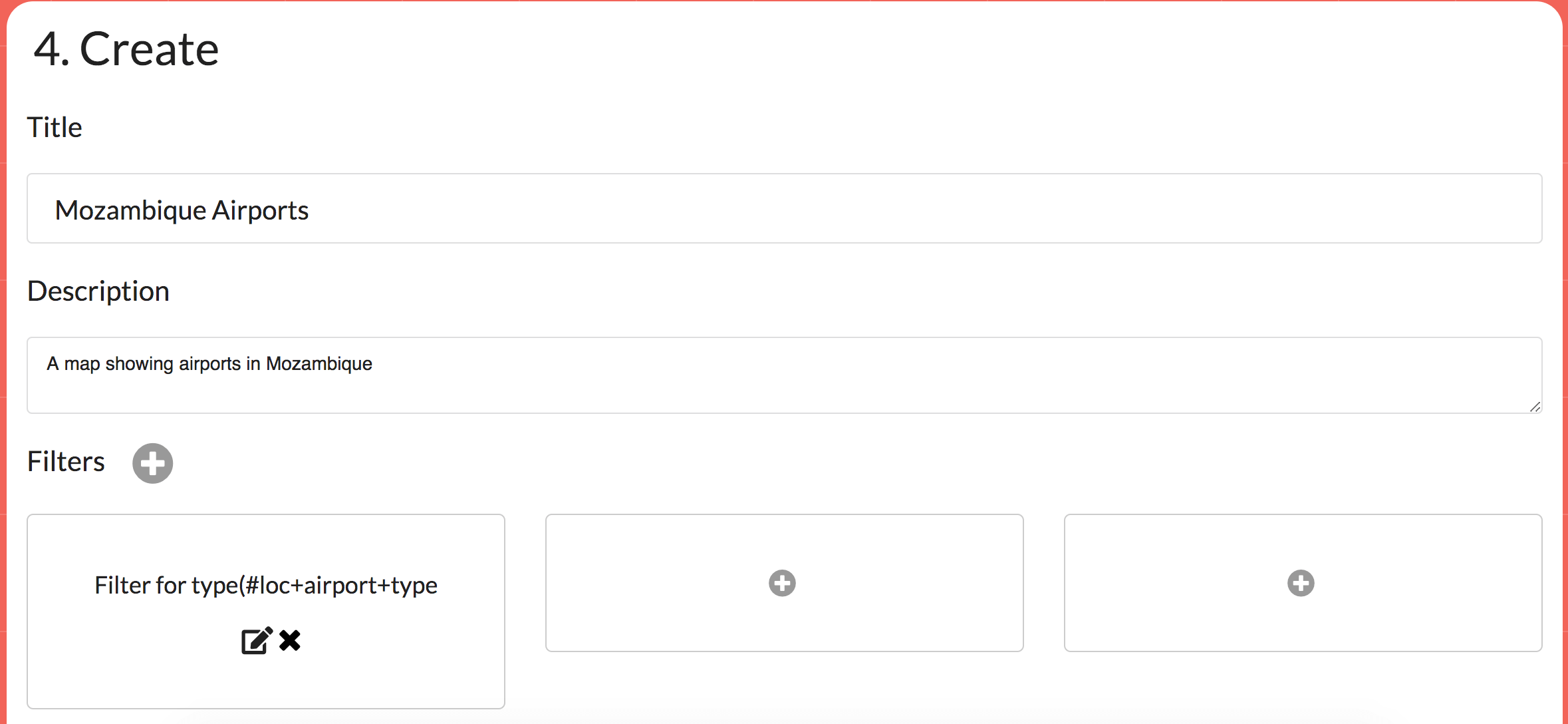
Filling in the details and adding a filter
5. Adding the map
Now we are ready to add the map. Click the plus sign in the top left corner of the layout you have choosen. In our case it was the one large box.

Adding the map
This brings a pop up where the charts and maps can be browsed and selected for adding. Click the maps tab and then select the Map of locations.
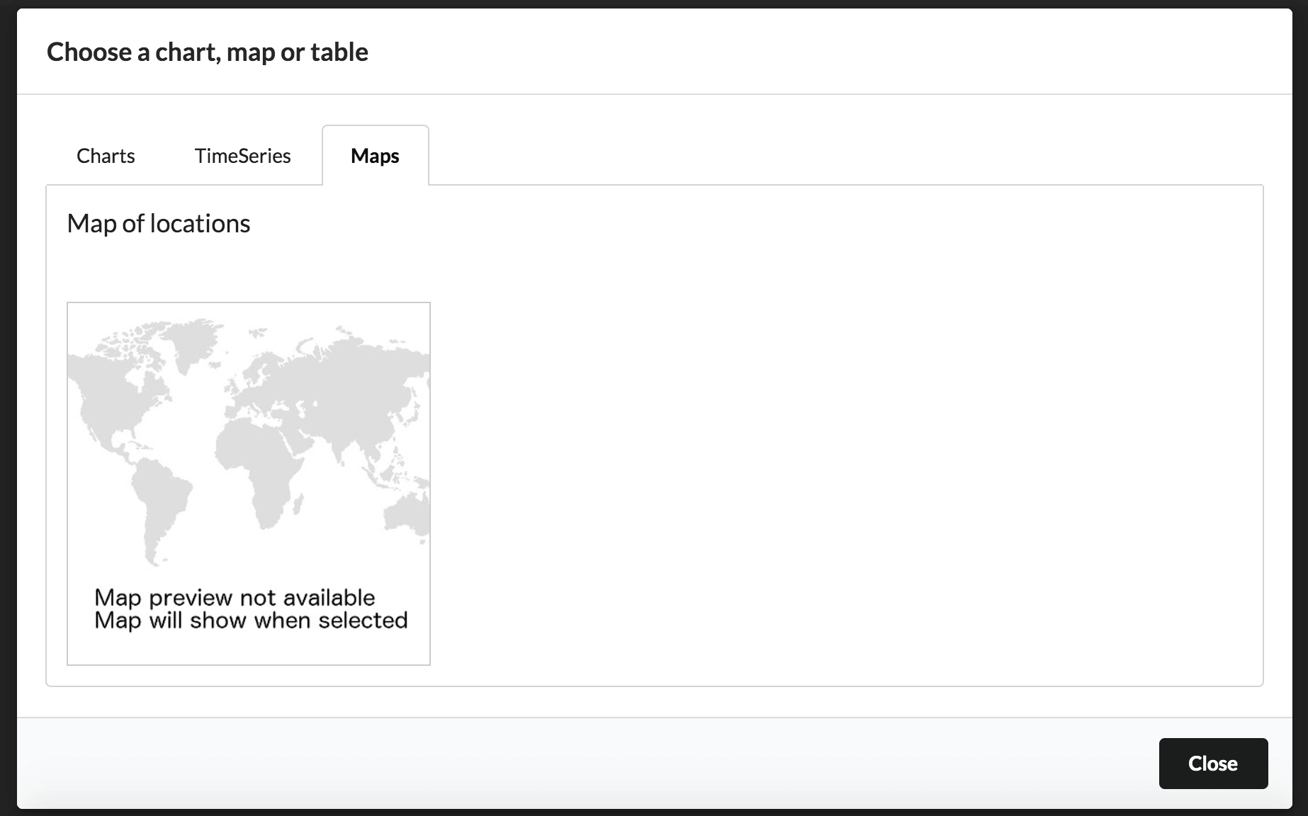
Choosing the map
This should add a point map the same as below. Hovering the mouse over the points provides further details
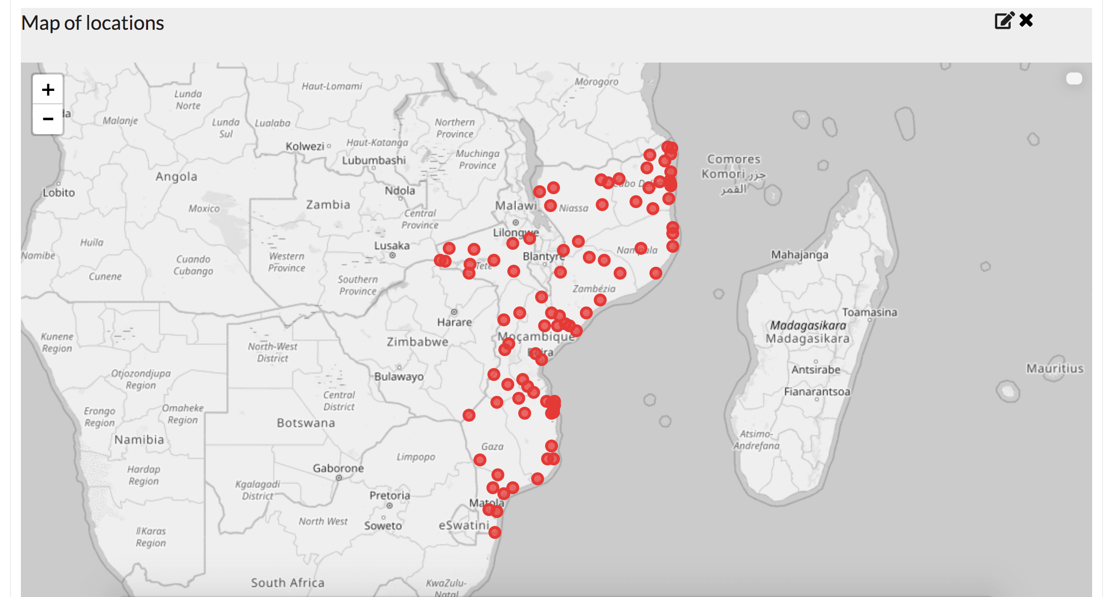
The map has been added.
6. Styling the map
At this point we could publish the map and share it, but first we are going to style the point colour and point size based on our data. Click the pencil edit button in the top right above the map.
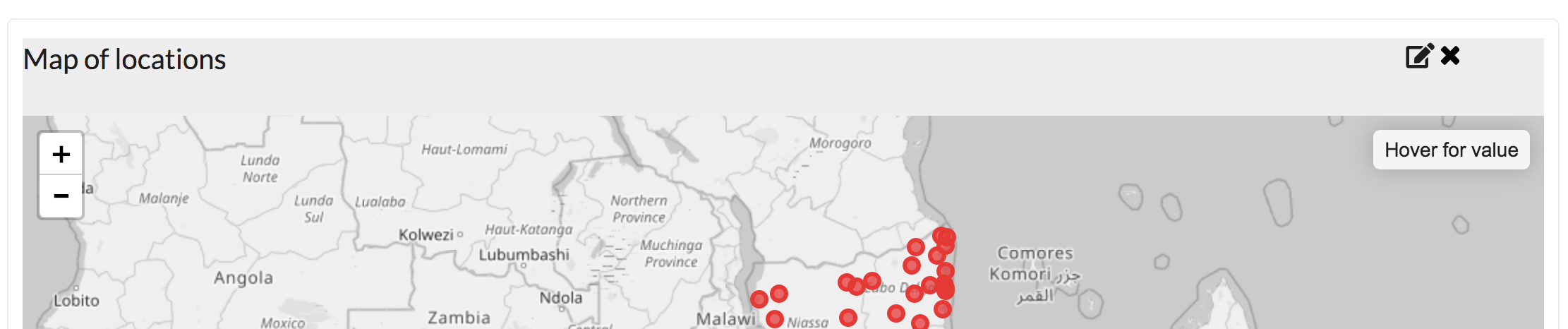
Click the pencil icon to edit the map
In the pop up that appears there are further options to edit the map. As seen below we have changed the title, sized the points by the score value (how important the airport is!) in the data and coloured the points by airport type. You can use the dropdowns to select these values.
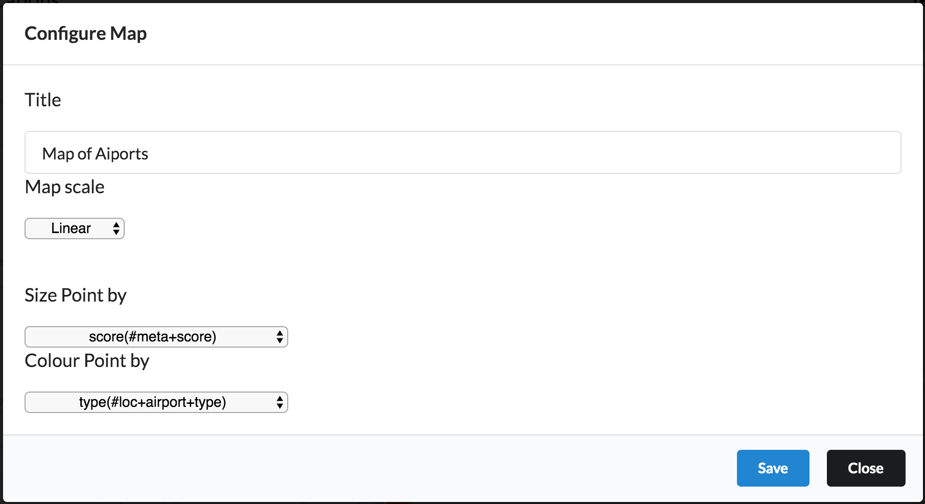
Map styling menu
Save those changes and you now get a map with the points coloured as per the airport type data and sized with how important they are
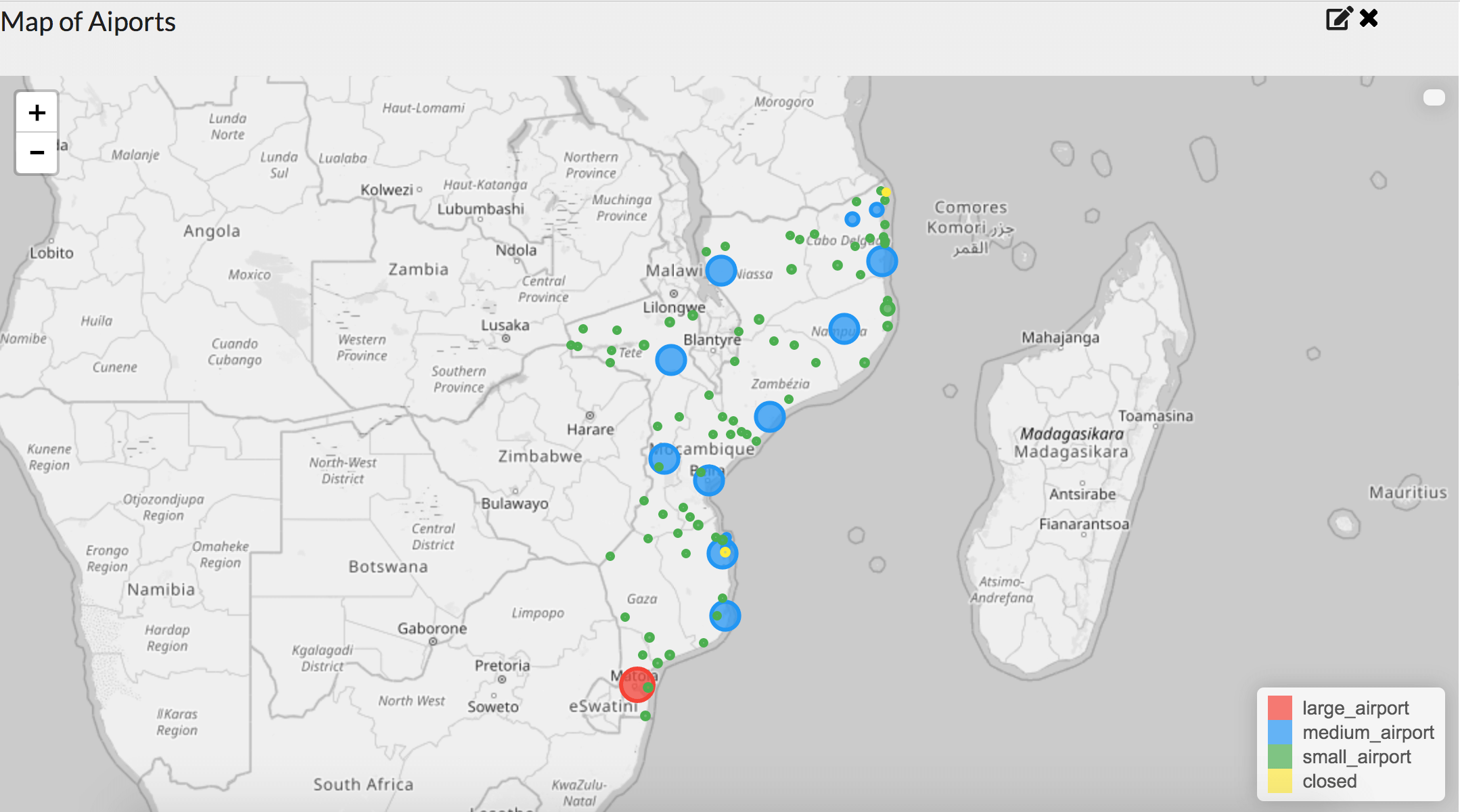
The map with new styling
7. Publishing
We will skip adding a data table and jump to the last step of saving our map. To do this click the save button. Enter a password in the edit password field if you want to make changes to the map at a later date. Clicking submit will save the map and take you to the published version.
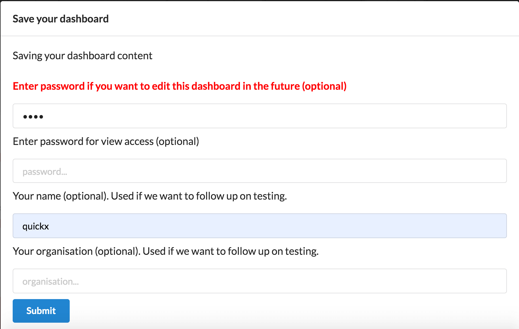
Saving the map
8. Finished Map on the Web!
And that's it our map is now on the web with the styles we chose. Click here to view our version of the map. Hovering a point with the map provides further details.
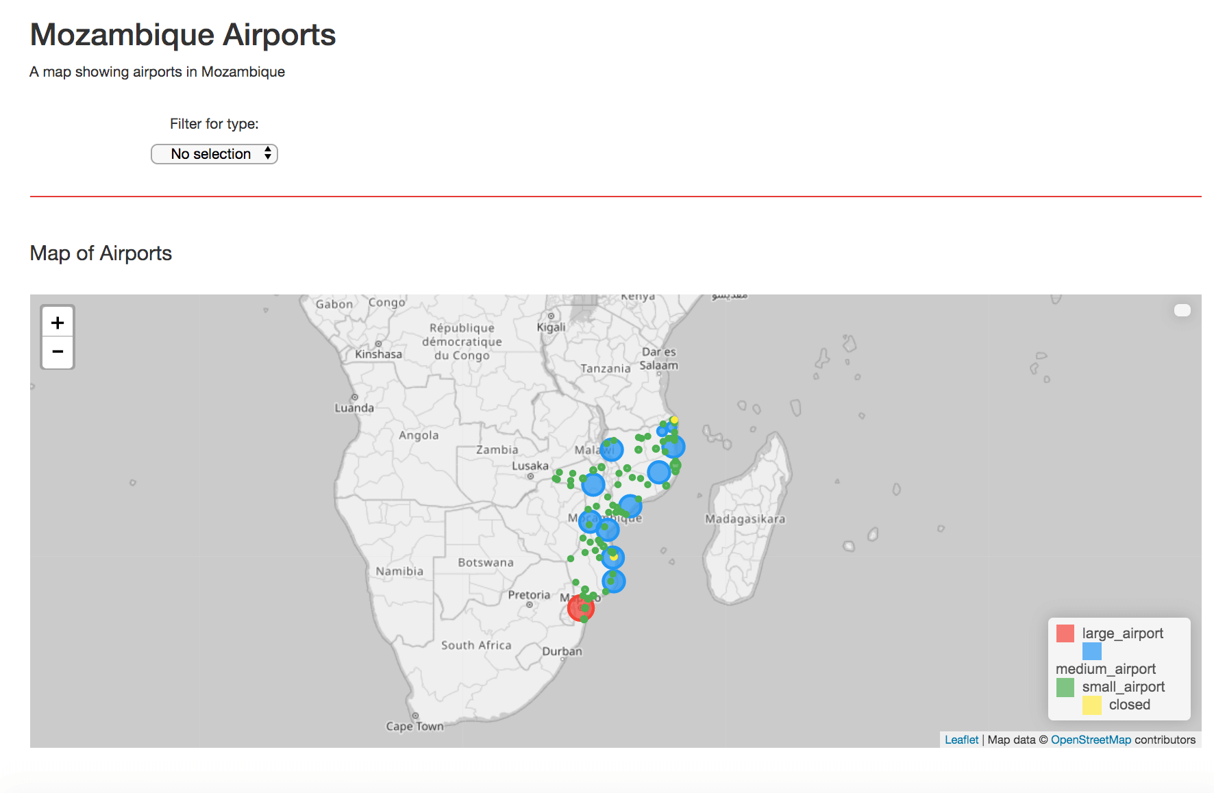
The final map
You can also use the drop down filter to show just the closed airports or the medium size airports for example.
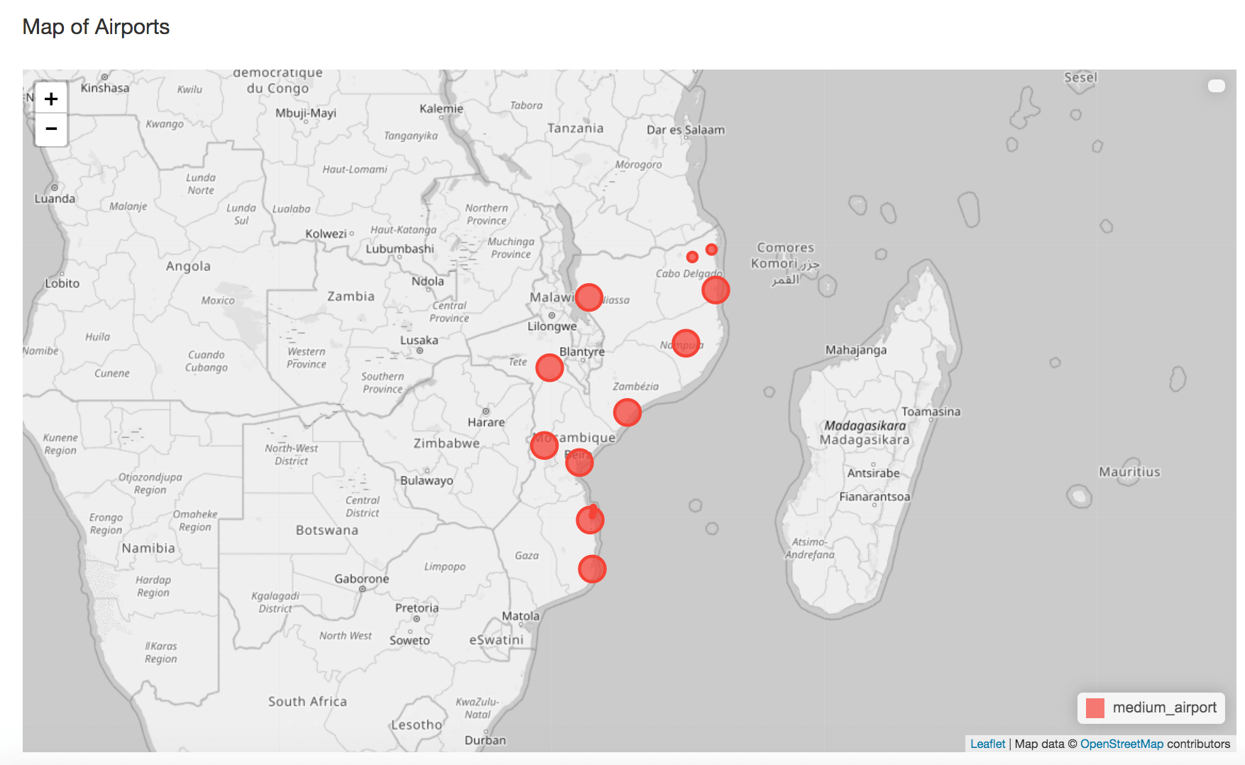
Filtering the map
If you want to go back and make any changes to the map, click the edit link in the bottom right and use the password from earlier.

Clicking the edit link allows you to go back and make changes to the map.